- Building my ePortfolio: A Body of Evidence
- Building my ePortfolio: Populating Content
- Building my ePortfolio: Choosing a Platform
- Building my ePortfolio: Gathering & Organizing Content
- Building my ePortfolio: What’s the outcome?
As I mentioned last time, it took me a while to move forward with my portfolio because the task seemed too ginormous, and I was having a hard time breaking it down into bite-sized chunks that my brain could handle. This was partially caused by my wanting to add a ton of content, but it was also because I felt really insecure about how I would use WordPress as a visual structure.
I knew that I wanted each project to exist as a post, and that each post would contain a written description of the project along with an image, an embedded PDF, or some other visual information that would provide better proof of what exactly I’d done. I also knew that I wanted to use categories to group projects into major headings (Publications, Customer Service, eCourse Development, etc), and tags to relate posts to one another regardless of category. So far, so good — all of these things are totally easy to do with WordPress. But how was I going to make it look good?

scaffolding, via keith1999 on flickr
I happily proceeded to the WordPress themes directory to find something that would make my portfolio look clean and organized. My dirty little not-so-secret? I don’t know a thing about visual design. Sure, I can point at things and say “That looks pretty” and “I like that.” But when it comes to figuring out how to actually make something that looks nice? Nope, don’t ask me. I’m also terrible at picturing what things would look like based on a model. I have to see the thing in action in order to mentally make sense of it. After a while, the thousands of themes available started to look pretty much the same.
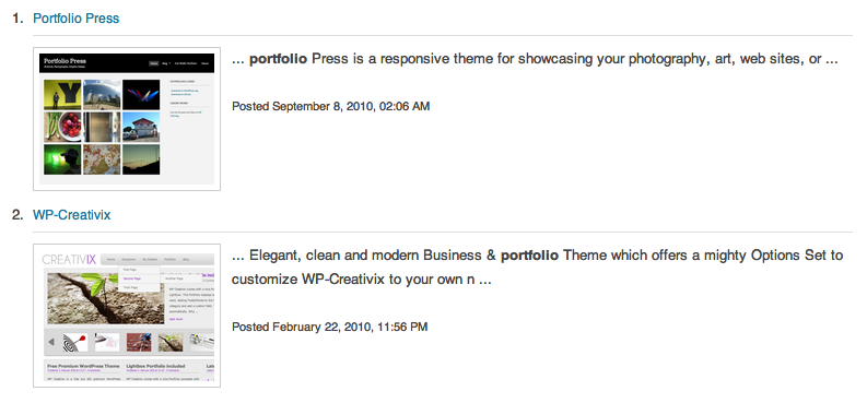
To narrow things down, I tried searching the themes directory for “portfolio” and got about 20 themes optimized for showcasing a visual portfolio. These themes would be great for photographers, who may want to include a brief explanation that goes along with each item, but for whom the emphasis is on the visual. I knew I wanted to have an image to represent each item, but it wasn’t supposed to be the most prominent part about the portfolio. The other tricky piece about this was that I wanted to use my site as a portfolio AND as a blog, preferably in the same place. Most portfolio themes I found assumed that visual artifacts would be an emphasis of the blog as well.
So I did something I’ve never done before: I started searching the paid theme sites. I’m very committed to the idea of WordPress as an open and free resource, and so in the past I have balked at paying for either plugins or themes. At the same time, I’m a big believer in paying people what they are worth, and in supporting the people that make products I like and use frequently. What I wanted was clearly more advanced than anyone was willing to do for free, so it was time to find a professional.
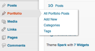
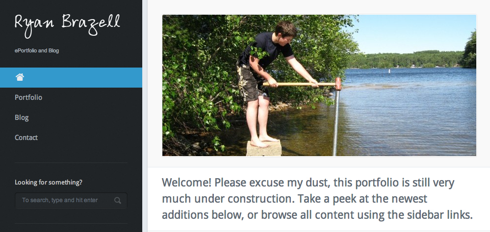
After browsing a lot of paid themes that placed the same emphasis on visual artifacts as the free themes I’d looked at originally, I finally came across one that seemed like it would work: Spark. It can handle both portfolio items and a blog, it looks really clean and organized, and even though it was created for visual artists, it gives equal weight to visual and written evidence. As I discovered after I installed the theme on my site, Spark does this by making blog posts and portfolio items into completely separate things within the WordPress infrastructure.
Portfolio items have their own set of categories and tags that are separate from the blog’s categories and tags, and there are widgets available for each set so they can be displayed separately. This way, your blog’s tags don’t take over your portfolio’s tag cloud, and vice versa. I hadn’t even thought this was possible, but after working with it for a couple of days it seems obvious. So far I’m very happy with how it looks and works, and this weekend’s project is to continue populating it with content.
Next in the “Building My ePortfolio” series: I’ll talk about how I’m populating my portfolio, including the process by which I’m finding and/or creating images to represent individual items. Feel free to take a look at what I’ve done so far, and let me know what you think!


